
This week, ProBikeKit turns 18! Our online cycling retailer has been around since 1998, having been established by a small group of keen cyclists in Cumbria. Since then, PBK has shared its expert road cycling knowledge with a worldwide audience and shipped goods to countries across the globe.
To celebrate our big 18th, we’re taking you back in time and showing you how the ProBikeKit logo has evolved since 2001. We’ve had some quirky ones, some professional ones, and some damn right strange ones!
ProBikeKit Logo Timeline:
-

2001
This is by far my favourite!A nice, blue eyed, blonde ProBikeKit cyclist greets us with a cheeky thumbs up in this very distinctive 90’s style logo.
-

2002
The 2002 logo is the same as the previous year, although emphasises our global business with the ‘worldwide’ slogan. Again, it has a 90’s old school design with a red white and blue theme. They blonde guy has stuck around so it looks like we simply loved this type of logo!
-

2002 - PBK USA
The ProBikeKit USA logo in 2002 was very loud, bright and patriotic, which made it differ from the main UK site. Nowadays, all of our logos across our international sites are the same.
-

2005
We lost the blonde guy!! 2005 saw a crankset incorporated in the title instead of our blonde mate. The crankset rotated, revolutionising the logo and making us very tech-savvy – it was quite hypnotic.
-

2006
2006 shifts to a more professional and bland logo, shortening the name of the site from ‘ProBikeKit’ to ‘PBK’. It also shows that we are an international business like the previous logo, with flags that click through to the relevant country’s site. Also looks like we chose to stick with red & white, taking blue out of the logo completely.
-

2008
In 2008, the logo turned quite glam. We love the star, the glimmer on the top right of the K gives us an outstanding touch on the logo – don’t you think?
-

2010
Same as 2008 but we decided to ditch the star. You can’t really see the outline of the PBK logo, but you would’ve done against the dark background on the website back then!
-
2011
2011 saw a shift to minimalism – it is simple and effective with no fuss, just the three letters of our brand. In fact, we still use this logo for the shortened ‘PBK’ acronym on site and it is also associated with the PBK Team and our clothing brand.
-

2012
In 2012, we changed from ‘PBK’ back to ‘ProBikeKit’ as it was in 2005. This move differentiates the retail site from the cycling team and clothing brand as we still use the logo as it was in 2011 for these on site.
-
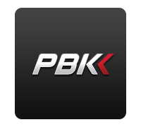
2016
Eighteen years on, we have a professional, global logo which is used across all of our international websites. It remained the same as last year’s, so it’s going strong – it’s clean, tidy and recognisable. We have found identity now that we’ve turned 18 years old and are likely to stick with this logo for a few years!
Which logo is your favourite one? What are your ideas for our next logo? Let us know on Twitter and Facebook with the hashtag #PBKBirthday and don’t forget to tag us @ProBikeKit